Salina Shares
Branding | identity Design

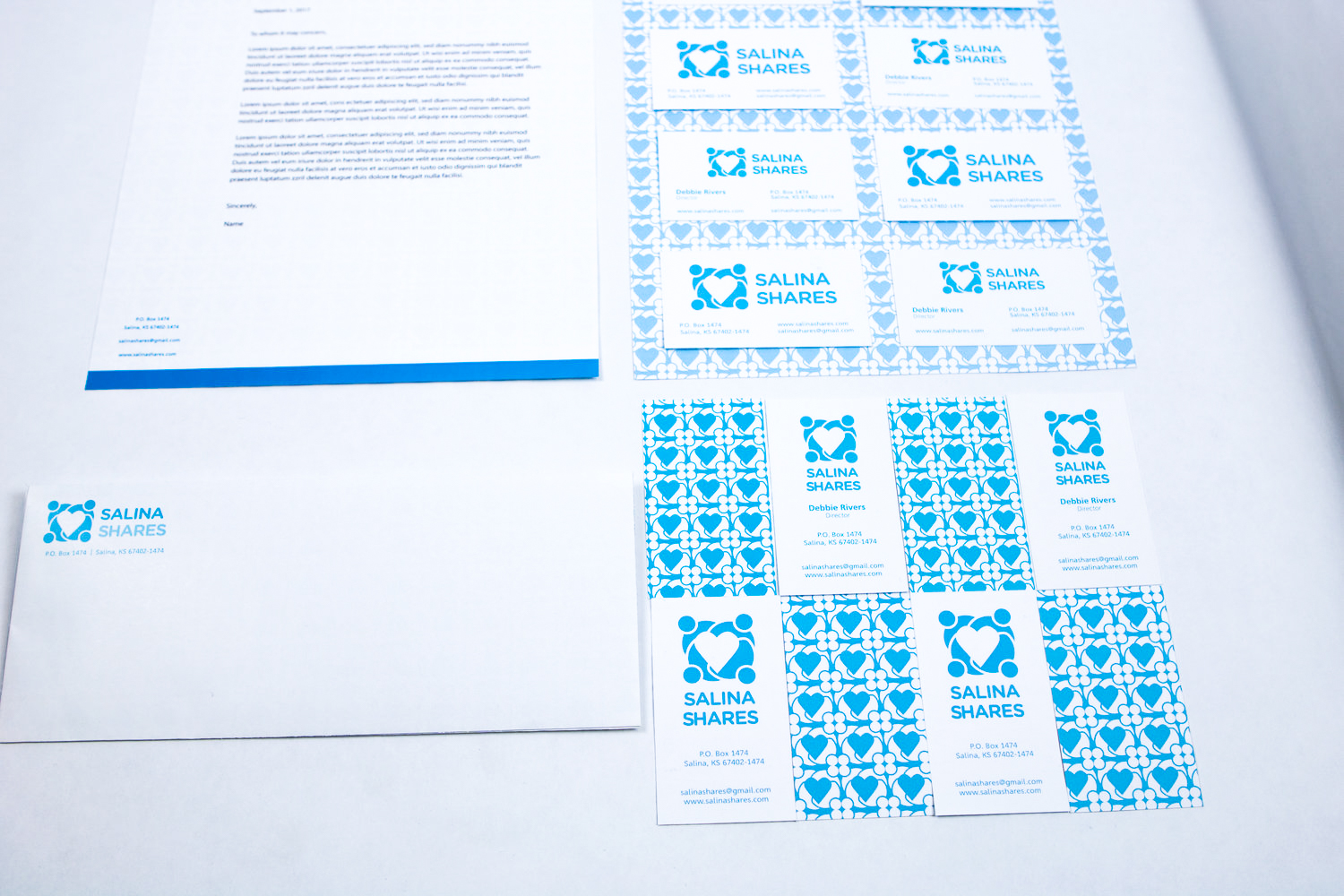
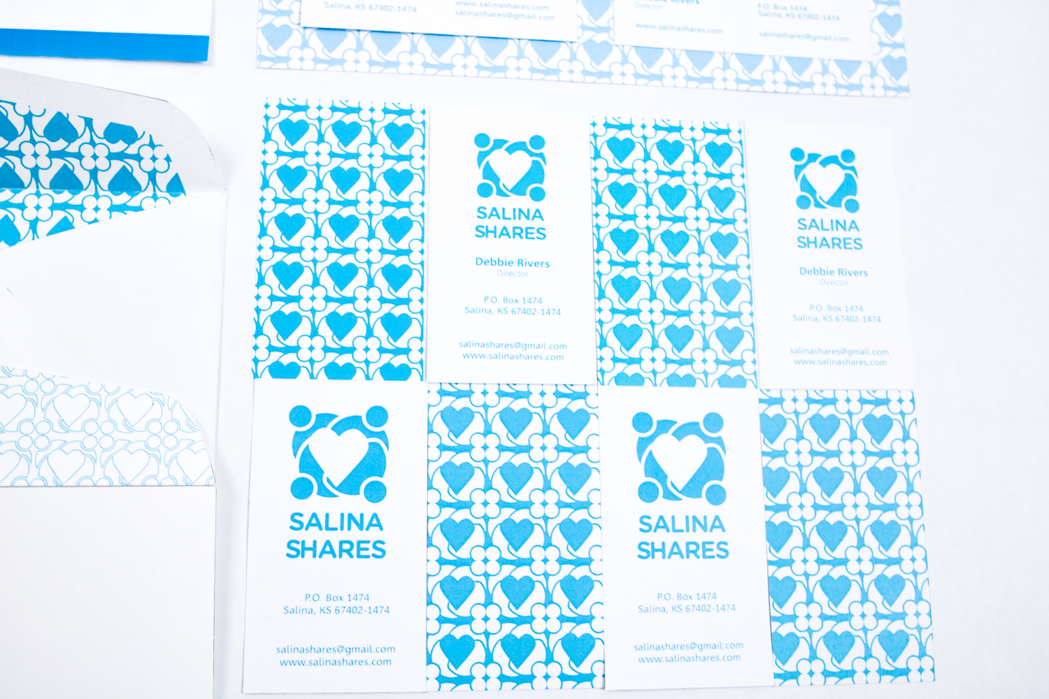
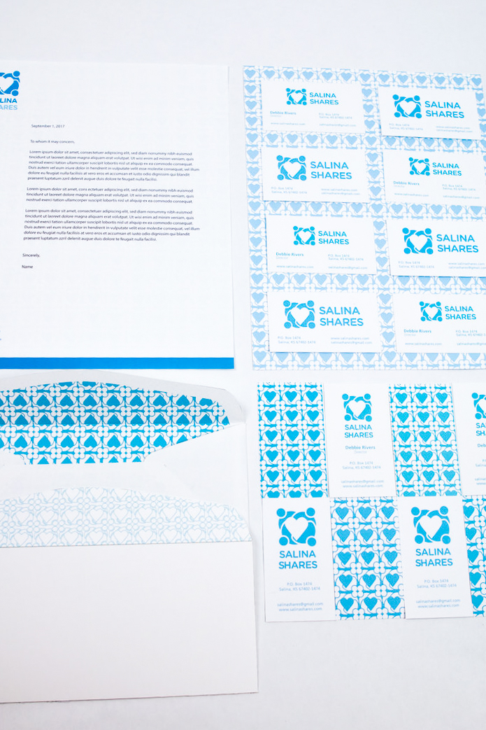
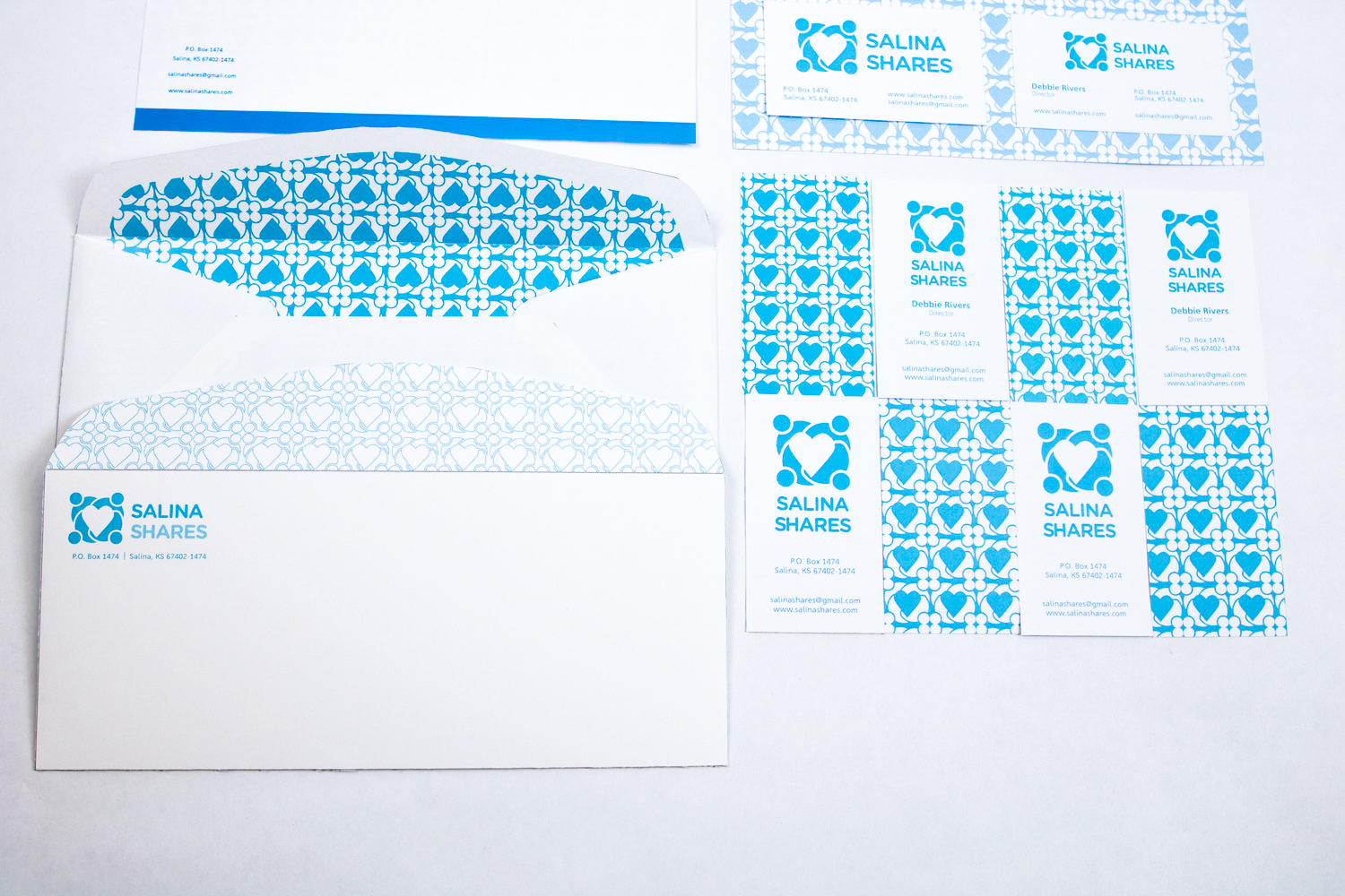
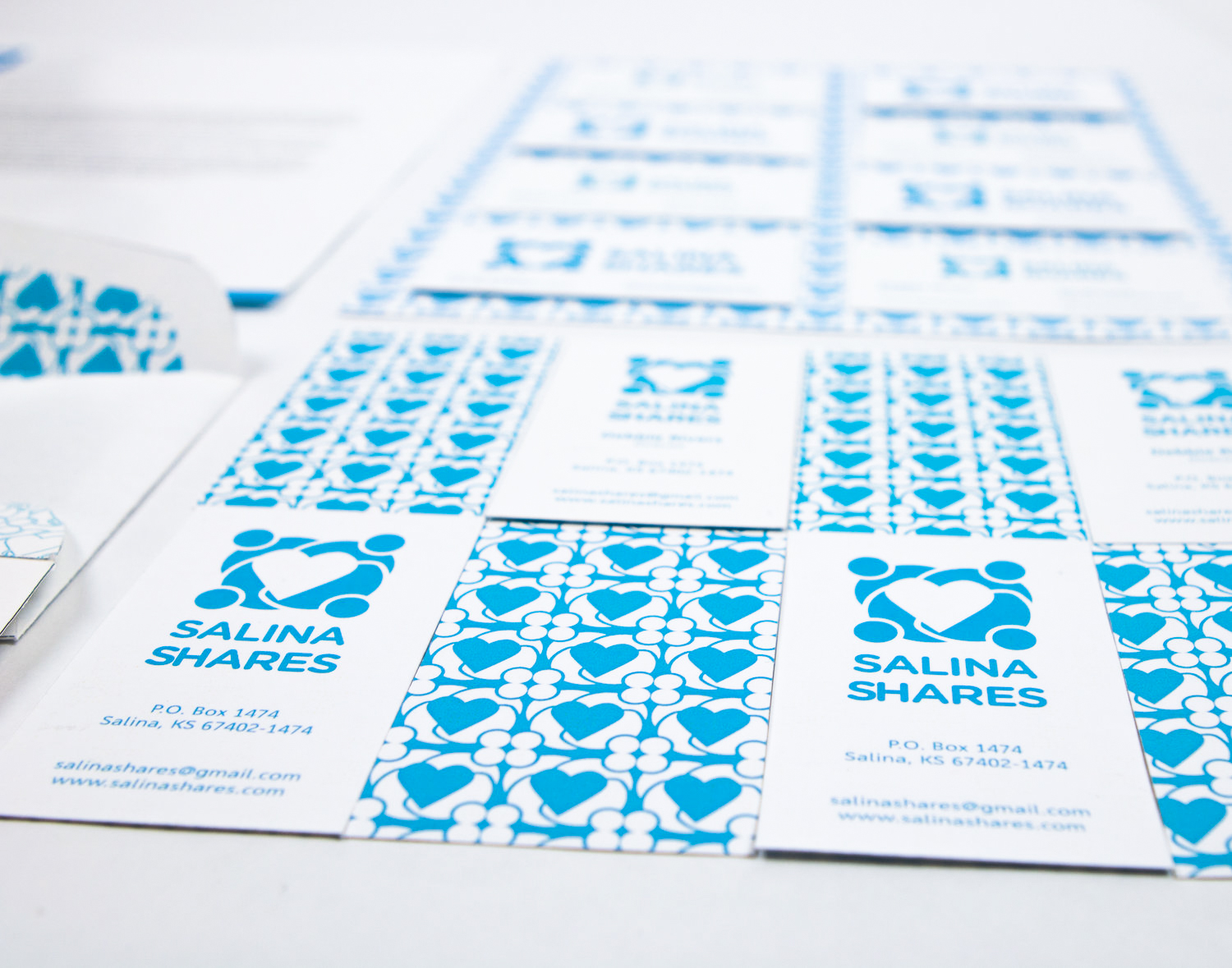
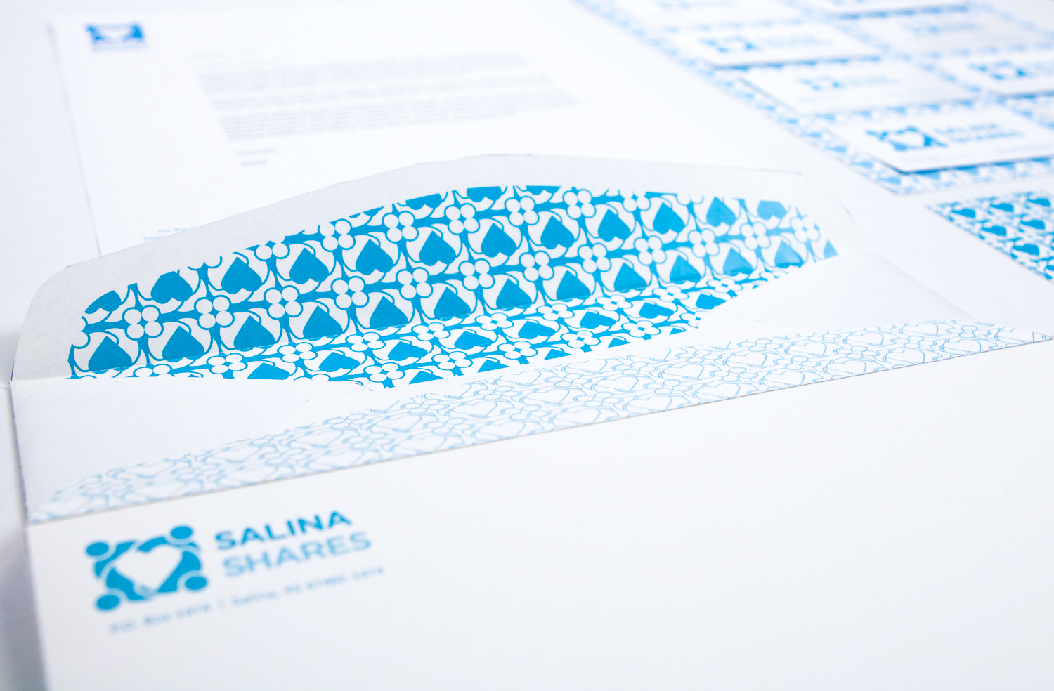
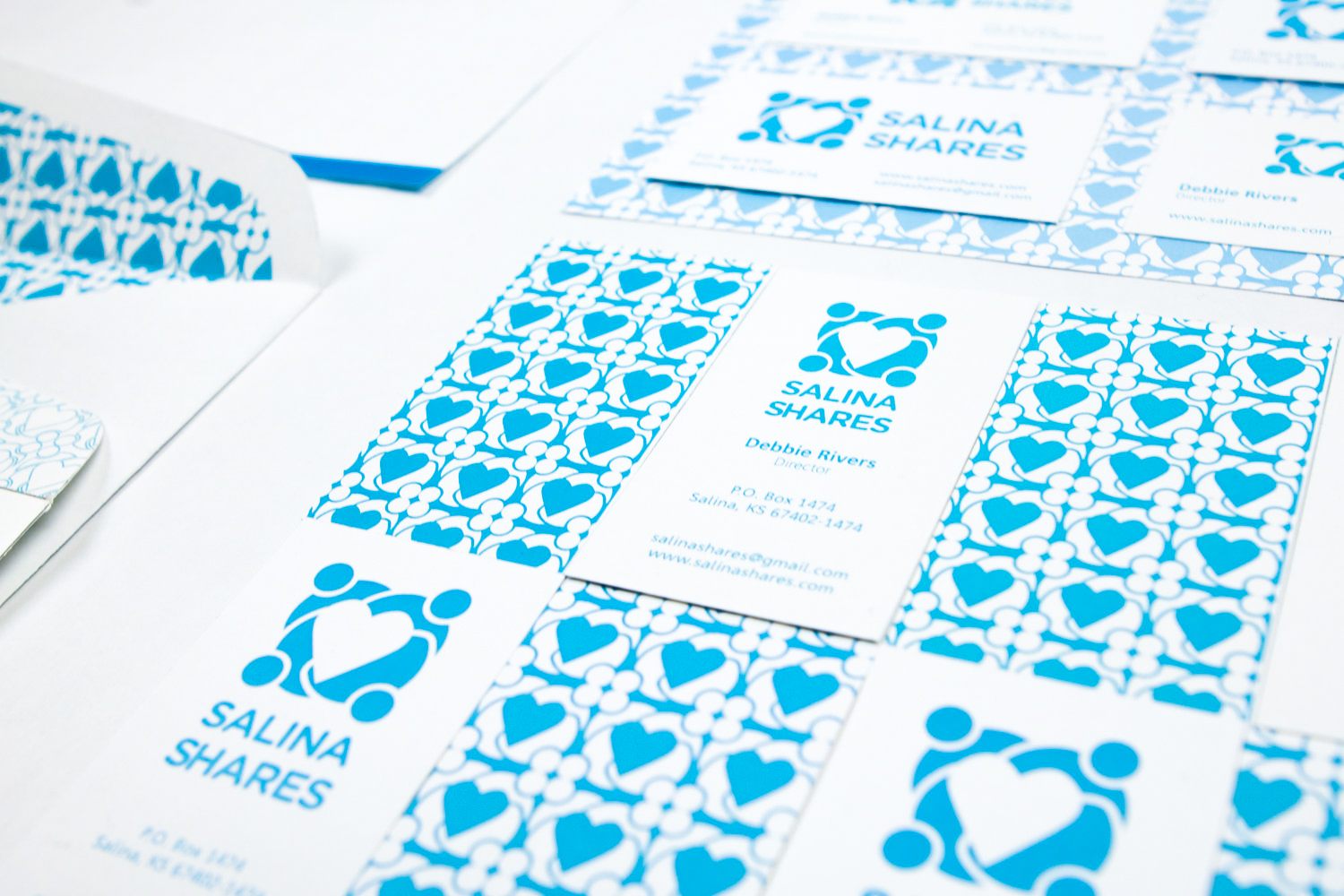
For Salina Shares we conducted a logo redesign project in which two designers were tasked in addressing problems with the client’s previous logo and creating a few iterations for a new redesigned logo. In addition to identifying the previous logo's issues, we also had to learn about Salina Shares and what they represent. After creating some iterations, we met with the board members and received feedback from them. The board then decided which logo they wanted to move forward with and the color they wanted for the final logo. Then we created a style guide and additional materials including business cards, a letterhead and an envelope. We learned that Salina Shares is about community partnerships and sharing resources to come together to help others. The designed logo conveyed community, approachability, and accessibility through the use of round corners, intersecting lines and connected shapes. The huddled figures stand shoulder to shoulder in solidarity holding the central symbol of the heart which represents the generosity of spirit and acts of kindness of Salina Shares.